Last updated on July 30th, 2025 at 10:29 pm

A bullet journal is so much more than just a planner—it’s a creative space that grows with you.
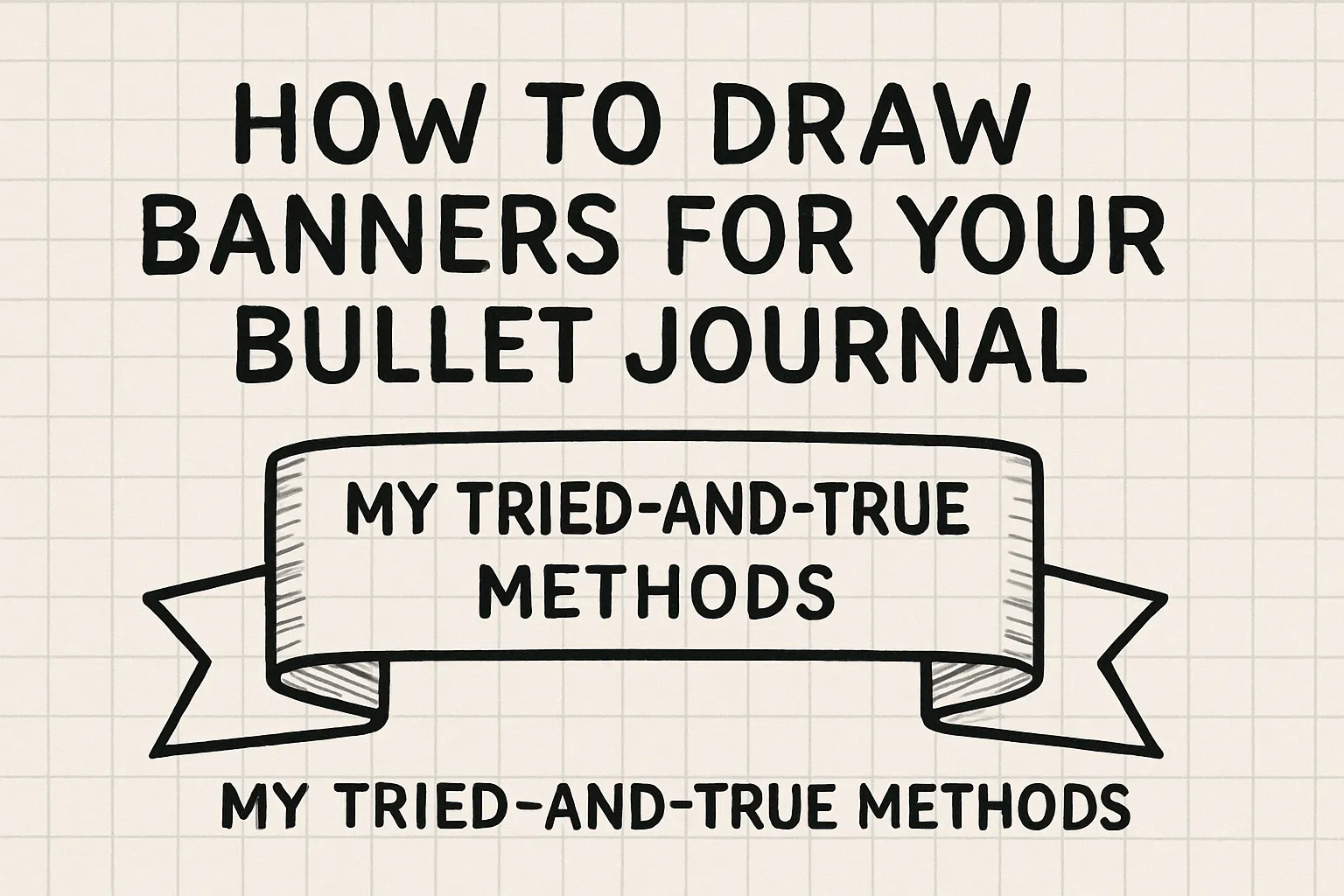
One of my favorite ways to add life to my spreads is by using banners to create beautiful, functional headers.
Over the years, I’ve developed a handful of banner styles that anyone can master, no matter their art skills or how much time they have to spare.
Below, I’ll walk you through my top banner techniques, including the details, materials, and tips for getting the most out of each.
Whether you’re a bullet journal novice or a seasoned “bujo” pro, there’s a technique here for you.
Table of Contents
Why Banners Matter in Your Bullet Journal
Banners and headers aren’t just for aesthetics—they serve real purpose. They help:
- Organize spreads so you can quickly scan for key sections.
- Add emphasis to important lists, like “Future Log” or “Week at a Glance.”
- Make reviewing past entries a more enjoyable experience.
- Bring personality to your notebook, making daily planning something to look forward to.
Banner Method 1: The Minimalist Block Letter + Highlighter Lines
This is my all-time favorite, and the method I use most frequently—especially on busy weeks. It’s fast, elegant, and requires only two common tools: your regular black pen and a pastel highlighter.
Step-by-Step Guide:
- Write the Heading in Block Letters
- Use your everyday black pen (the same one for your regular entries).
- Examples:
- Week 2 July 2025
- Future Log 2025
- Steps to Clear PhD Entrance Exam
- Position the Heading
- Place your heading anywhere: top center, right, or even the top left corner.
- If writing in the top left, leave a small space before the text (don’t crowd the edge).
- Draw Highlighter Lines Beside the Heading
- Using a pastel highlighter, draw a horizontal line to the left and to the right of your block lettered heading.
- The lines bookend your words but do not cross behind or underneath the actual text.
- If your heading is left-aligned, make the left line short (since there’s less space) and the right line longer for a balanced look.
- Enjoy the Pop
- This side-highlighter technique draws attention to your heading without overwhelming the page.
- It’s also neater than highlighting the entire text—as the letters stay crisp and legible.
Why I Love This Method:
- It’s quick and fuss-free—ideal for daily or weekly logs.
- The result is always tidy, even if you’re not naturally artistic.
- Works with virtually any pen/paper combination.
- Great for minimalists and productivity-focused journalers.
Also Read:
- How to Draw a Calendar in a Bullet Journal: Step-by-Step Guide for Beginners
- How to Create a Bullet Journal in OneNote: Step-by-Step Digital BuJo Guide
- How to Decorate Your Bullet Journal: The Ultimate Guide (Tips, Ideas & Tools)
Banner Method 2: Using Sticker Sheets or Printable Banners
On days when I want my spread to look extra polished—or if I’m short on time—I love reaching for plain banner stickers or printables.
Step-by-Step Guide:
- Choose Your Banner Sticker
- Select a plain banner from your sticker collection or use a printable banner you made or downloaded in advance.
- Apply the Sticker/Banner to Your Page
- Peel and stick the banner in your desired spot, or glue a printable.
- Write In Your Heading
- Use your black pen to add the title (just like in the block-letter method).
- Writing atop a plain banner helps your header stand out among more elaborate background patterns.
- Optional Embellishments
- Add dots, dashes, or tiny stars at the corners for flair, or keep it simple for a modern look.
Pro Tip:
- If you don’t have sticker sheets, you can make your own banners by cutting shapes from colored paper or using washi tape as a base. Else, you can download printables for these banners here.
Why I Use This Method:
- It adds variety and texture to your journal.
- Sticker banners are quick to place and require no drawing ability.
- Ideal for themed spreads, special events, or when you want to switch up your style.
Also Read:
- How to Write a Bullet Journal Using Calligraphy: A Comprehensive Guide
- The Story Behind the Bullet Journal: A Journey of Curiosity and Creativity
- How to Use a Bullet Journal: A Simple Guide to Making It Work for You
- How to Write Quotes in a Bullet Journal?
Banner Method 3: DIY Cuboid Banner With Pencil and Pastel
Sometimes I want my headings to “pop” a little more—especially for monthly overviews or celebratory spreads. This cuboid banner (which looks like a 3D box) is a playful yet still approachable style.
Step-by-Step Guide:
- Draw a Cuboid With Pencil
- Lightly sketch out a rectangular box around where your heading will go.
- Add thin side and bottom lines to give it a 3D “cuboid” effect.
- Fill With Pastel Highlighter
- Color inside the cuboid (not too dark) using a pastel highlighter or colored pencil.
- The gentle color provides a soothing background that won’t overpower your text.
- Go Over Outlines With Matching Pen
- Choose a pen in a similar shade to your highlighter (or use a coordinating color).
- Carefully outline the cuboid to sharpen its edges and enhance the 3D look.
- Write Your Heading Inside
- Use your favorite black pen for contrast, or coordinate your ink with the cuboid color.
- Finishing Touches
- Add shadows by going over one edge with a slightly darker tone—totally optional, but effective.
Why This Banner Works:
- It delivers a pop of color and depth, making special spreads feel inviting.
- Easy to customize for any mood, season, or theme by changing colors.
- Still quick compared to complex hand-drawn banners, but with more visual interest.
Also Read:
- How to Use a Bullet Journal for Work: Step-by-Step Guide, Tips & Inspiration
- How to Use Washi Tape in Bullet Journal | Creative Ideas & Tips
- How to Write Neat in a Bullet Journal: Tips, Tools & Layout Ideas
- TV Show Tracker Bullet Journal: Ultimate Guide, Ideas & Layouts for TV Lovers
- How to Make a Bullet Journal on Lined Paper: A Step-by-Step Guide
Banner Method 4: Calligraphy for Statement Spreads
When I want my bullet journal to really shine—or for special spreads like “Goals for the Year” or “My Bucket List”—I pull out my fountain pen with a flat, thick nib and embrace calligraphy.
Step-by-Step Guide:
- Select a Flat Nib Fountain or Calligraphy Pen
Choose a tool you’re comfortable with—fountain pens, brush pens, or even a broad-tip marker will work.
- Practice Your Lettering—If Needed
If you’re new to calligraphy, practice a few strokes on scrap paper first to get a feel for the angles and pressure.
- Write Your Heading in Latin Calligraphical Style
Use broad downstrokes and thin upstrokes for contrast and elegance. Make sure to leave enough space for your title—the larger lettering takes up more room. If you’re familiar with any other font styles, choose a bold one and make that your standard.
- Embellish If You Like
Add flourishes, shadows, or colored dots for accent.
When I Use This Method:
- For the spreads that I’ll refer to all year, or when I want to savour the process of creating my journal.
- When I want the heading itself to be a piece of art.
A Note of Caution:
- Calligraphy takes a little practice. Don’t be discouraged by messy early attempts!
- Use smooth paper to avoid ink bleeding; experiment to see what works for your supplies.
Which Banner Is Right for You?
- New to bullet journaling or prefer minimal effort? Start with method #1—the block letter with highlighter lines. It’s reliable, crisp, and never fails to impress.
- Want to add variety and flair? Try sticker banners or the cuboid pastel banner for an easy eye-catcher.
- Love to experiment with pens and fonts? Dive into calligraphy for a classic touch.
Also Read:
- How to Make a Mood Tracker Bullet Journal: Step-by-Step Guide for Beginners
- How to Start a Simple Bullet Journal: The Ultimate Beginner’s Guide
- How to Make a Digital Bullet Journal in Keynote – Step-by-Step Guide
- How to Use a Bullet Journal for Weight Loss?
- How to Use a Bullet Journal Effectively: Your Ultimate Guide
- How to Write a Bullet Journal: The Ultimate Step-by-Step Guide
Pro Tips for Great Bullet Journal Banners
- Always test new pens or highlighters on a back page first, to check for bleed-through or feathering.
- Don’t be afraid to mix methods—combine banners with small doodles, washi tape, or stickers for a personalized touch.
- Keep it functional. If adding banners slows you down or feels stressful, choose a quicker method so your bullet journal remains a tool for productivity and joy.
- Practice makes progress! Even the simplest banners look sharper with a bit of repetition.
Bullet journaling is what you make of it, and banners are just the beginning. With these standard steps—tried, tested, and loved in my own bullet journal—you have a toolkit for bringing structure and style to your life. Happy journaling!